I've been building Rainforest Studio for a while now. A cultural RAG tool. A living archive. Infrastructure for the kind of memory that doesn't survive in databases built by people who never had to fight to be remembered. The mission is clear. The tech is progressing. The writing on the site is good.
And then I looked at the actual website and thought, yeah, this could be literally anyone's.
White backgrounds. Clean sans-serif. Tasteful green because "rainforest". Stock photography energy without the stock photography. It looked like a template with ambition. The content was doing all the heavy lifting and the design was just... there. Existing. Not helping.
That's the worst version of a website, by the way. When the words are alive and the visual layer is dead.
The problem wasn't aesthetics
It would've been easy to fix if it was just "make it prettier." Throw some gradients around. Add a hero animation. Ship it.
But the gap was deeper than that. Rainforest Studio is about connection. It's about a recipe from Brixton linking to an oral history from Peckham linking to a textile pattern from Accra. It's about things feeding into each other, growing together, creating context that didn't exist before. The whole point is that nothing in the archive exists in isolation.
The site looked like everything existed in isolation.
Cards in a grid. Sections stacked on top of each other. Information laid out like a brochure. Technically correct. Emotionally empty.
Ecosystem, not organism
I started talking through what I wanted and kept saying "living." I want it to feel living. Breathing. Organic. And the first attempt at that was fine. Animations, gentle movement, things that pulse. But it still felt like individual elements doing their own thing. Alive but alone.
Then I realised the word I actually needed was "ecosystem."
Not things that breathe independently. Things that connect. Things that feed into each other. Nodes in a network, not items in a list. When you add a partner to the archive, the whole system gets richer. When a community shares their stories, those stories connect to other stories nobody expected them to connect to. That's the magic. That's what the site needed to show.
One word changed everything.
What the redesign actually looks like
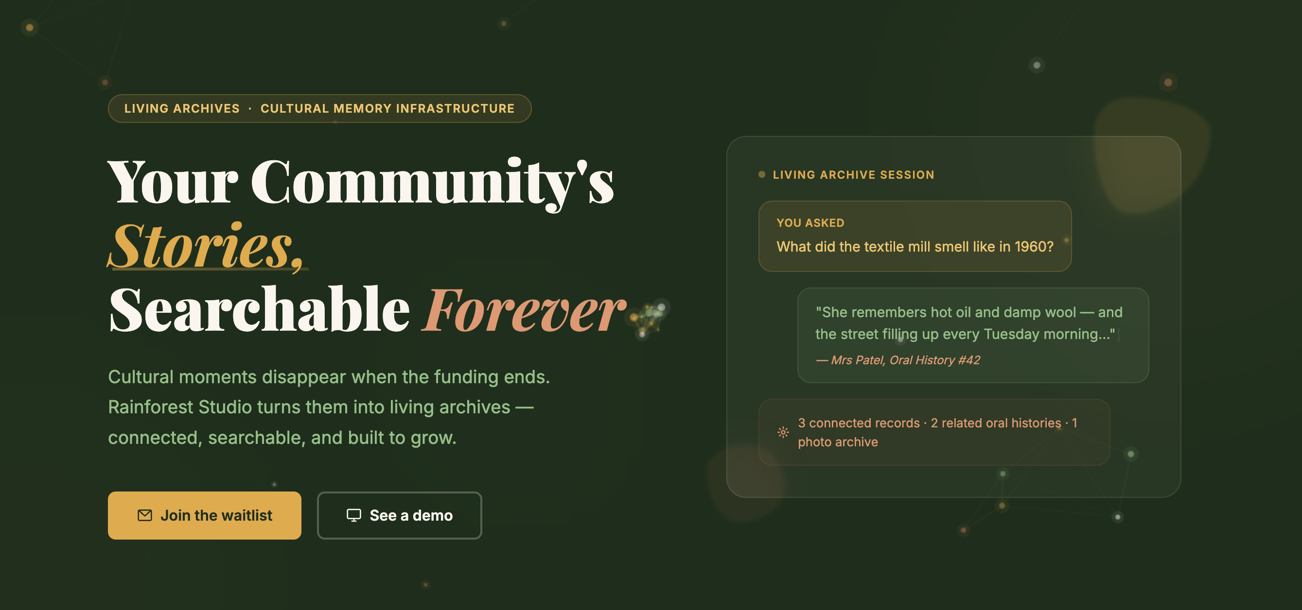
Six pages, rebuilt from scratch. Every one of them now has a canvas-based visualisation underneath the content. Not decorative. Structural. The homepage has a mycelium network where nodes connect when they're close to each other, and they gently drift towards your cursor. The partner page has an ecosystem map where you can see community partners, cultural institutions, and tech collaborators as actual nodes with signal dots flowing between them.
The colour palette shifted too. I'd been defaulting to green-on-white because, well, rainforest. But warm cream backgrounds instead of white changed the entire feeling. Easier on the eyes. Less clinical. More like something you'd want to sit with. Amber and terracotta accents break up the green monotony. It finally feels like a place, not a product page.
The Threads of Memory project page has this scrolling golden thread that tracks your progress down the page, with nodes you can click to jump between sections. The About page has a particle bridge animation showing the "legacy gap" that the studio exists to close. Every page has elements that visibly connect to other elements. SVG paths between cards. Signal dots flowing along connection lines. Things feeding into things.
The bit I didn't expect
I built all of this with AI. Not as a replacement for having taste, but as a way to iterate at the speed of thought. I could say "this feels like items in a list, not an ecosystem" and see the next version in minutes. I could say "I prefer cream to white, it's easier on the eye" and have every page updated before I'd finished making tea.
The thing about building with AI is that it's brilliant at executing once you know what you want. The hard part is still knowing what you want. I had to sit with that "I feel nothing" reaction long enough to understand it wasn't about colours or animations. It was about the site not reflecting the core idea. Interconnectivity. Once I had that word, everything moved fast.
What's next
The mockups are done. Six HTML pages with a full design system, animation library, and responsive behaviour documented in a handoff spec that's frankly more thorough than most I've seen from agencies. Now comes the part where it becomes real. Moving from mockups to the actual Remix build. Figma files are already started.
I'm going to keep writing about the build as it happens. The decisions, the wobbles, the bits where I'm clearly winging it. If you're building something and it doesn't feel like you yet, maybe start with the question I should've asked earlier.
What's the one word that describes how your thing actually works?
Mine was ecosystem.